Designing for
hotel owners.
Speculative founding sprint
Interview work · Aug–Sep 2026


Who I designed for
The brief’s customer: Don, owner of Brass Lantern Inn. He handles guests and marketing, with little time for another tool.
Autumn automates marketing for independent hotels. My task: a homepage that explains the offer and a dashboard that shows booking results.
My role
I designed and built both prototypes for a Founding Design Engineer interview.
What you’re looking at
The submitted prototypes and later design revisions are shown separately. Dashboard figures come from sample data.
Before signup.
After the booking.
Autumn covers paid-search ad spend for independent hotels and charges 13% on the bookings it drives. Both surfaces must work for an owner balancing marketing with day-to-day guest service.
Homepage / Before signup
Why should I try Autumn?
Owners arrive from outbound email, often on a phone. Sales and recruiting live on separate sites. One homepage must explain the offer to owners and give candidates a route into the company.
Dashboard / After signup
Is Autumn earning its fee?
Owners need to know which bookings Autumn drove, what they were worth, and what they cost. Existing reports showed ad metrics without making the business result clear enough for a busy innkeeper.
One homepage for two audiences.
Homepage · refined design
Illustrative exercise content

Preparing the devices…
For hotel owners and potential hires, on desktop and mobile.
References and design decisions.
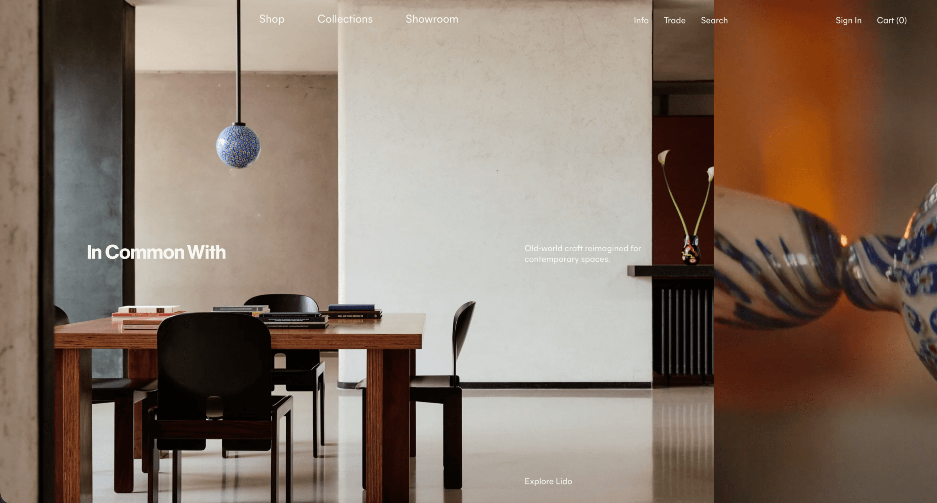
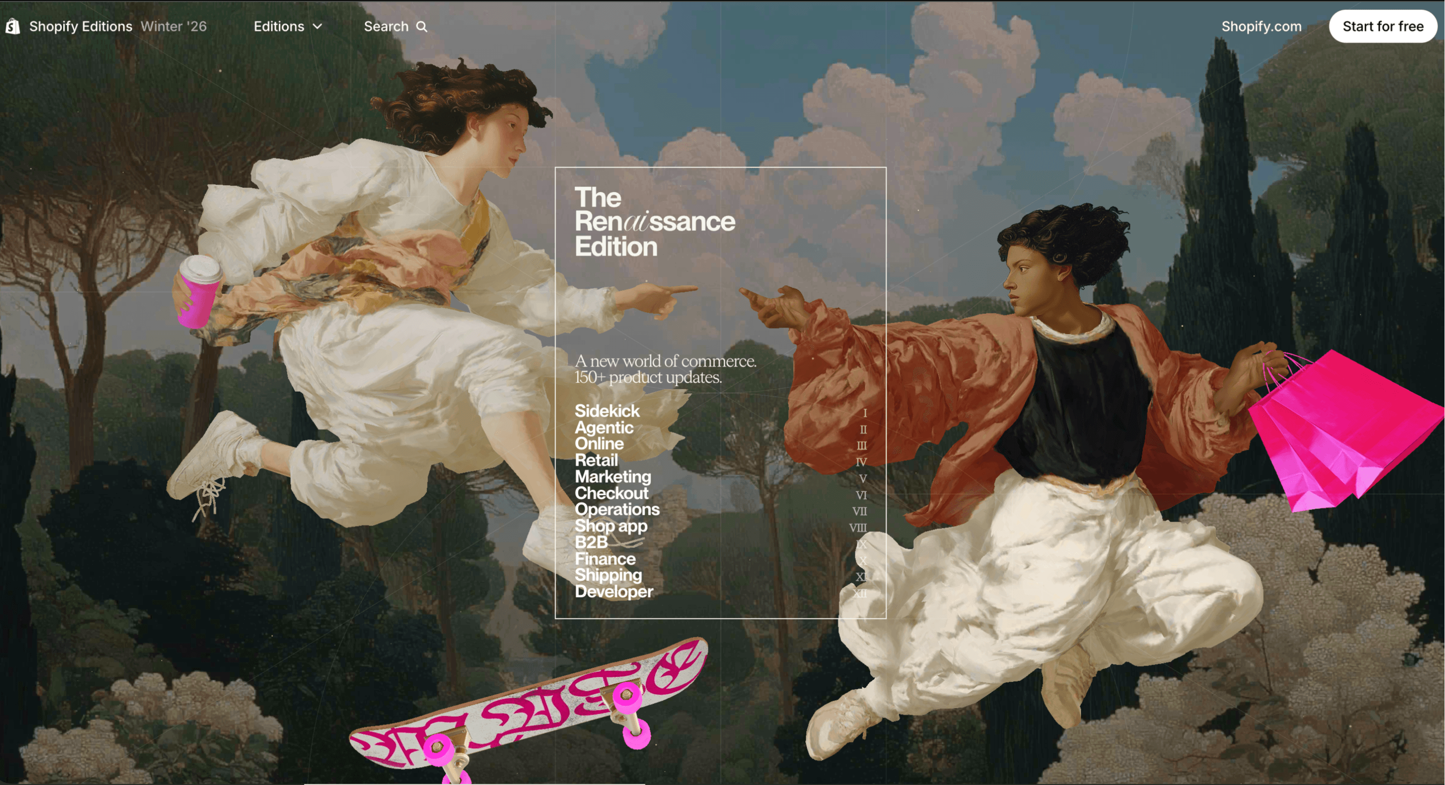
Homepage / principle → application
Make the cost clear first.
I led with 13% on ad-driven bookings and covered ad spend for an owner arriving by phone. Autumn’s identity stays intact; photography supplies the color. In Common With and Shopify Editions informed the imagery and sequence. Motion follows one booking. Illustrative proof includes a low result and a “not reported” state.
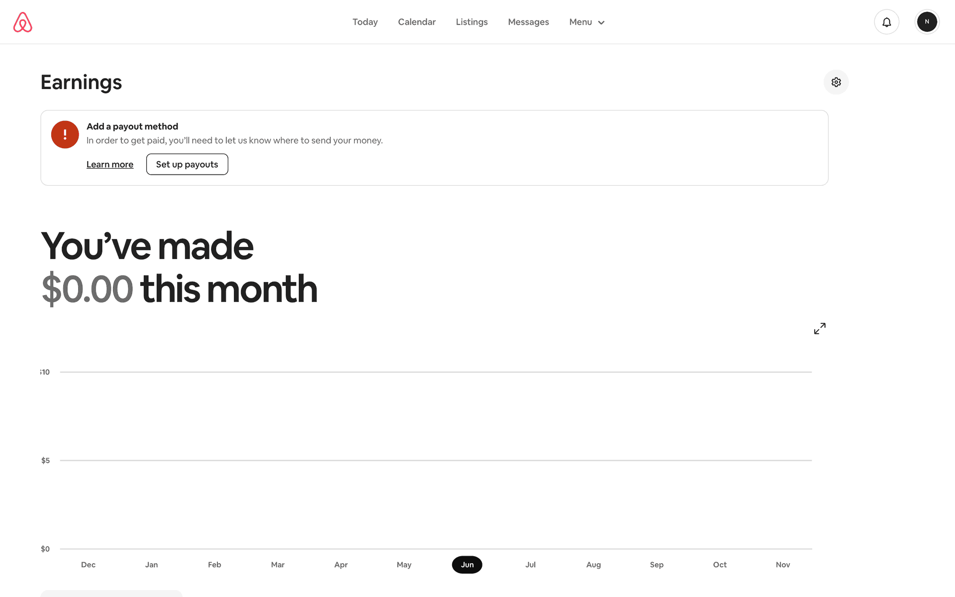
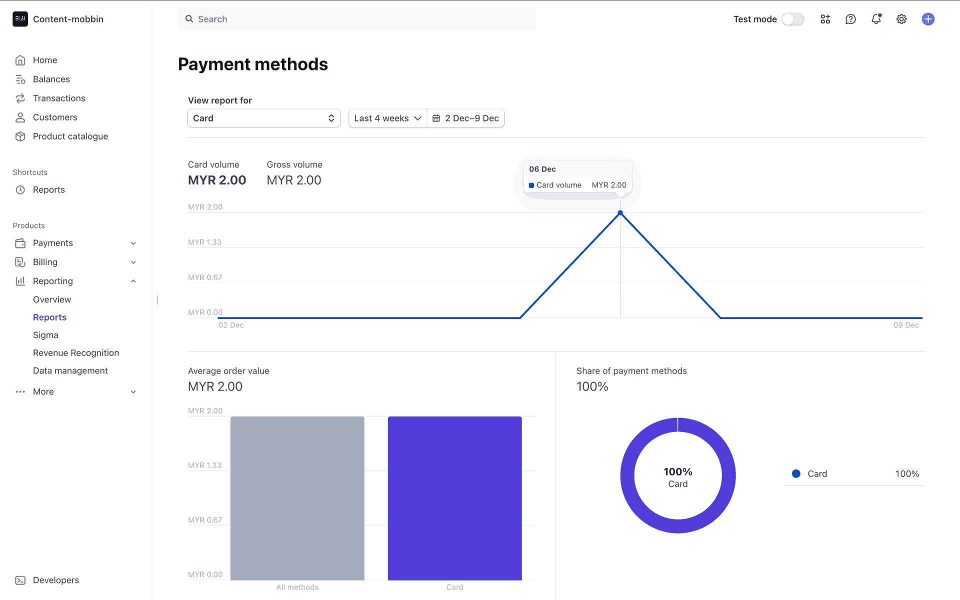
Dashboard / principle → application
Let the owner check the claim.
Airbnb informed the result-first summary; Stripe informed the shared date range. I put booking value beside cost and a commission comparison. The second screen opens the same bookings as a ledger, so an owner can check the headline against their reservation system. “Shown, visited, booked” replaces marketing jargon.
Reference captures from my research · Airbnb and Stripe via Mobbin.
Two briefs.
Two working prototypes.
Take-home 1
Homepage / brief deadline
The site had to sell and recruit. I built careers and pricing from shared components, beyond the homepage brief, and corrected small, low-contrast labels for phone reading.
Take-home 2
Dashboard / brief deadline
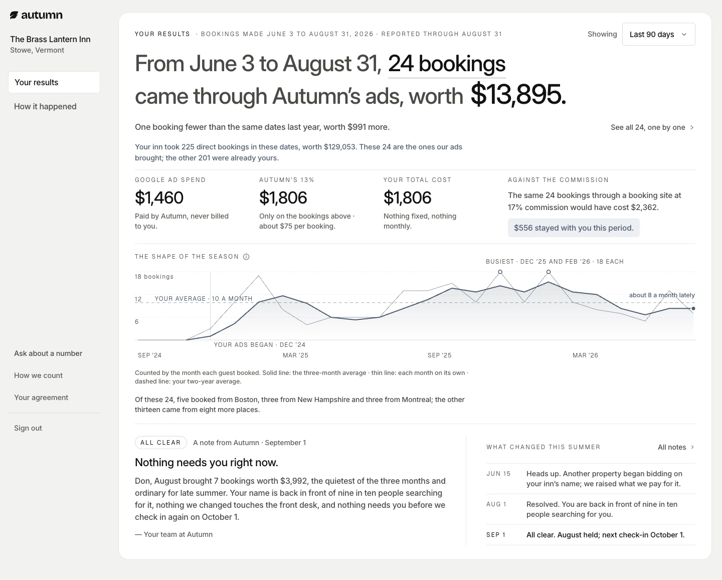
I made a plain-language "Results" screen for a quick answer and a connected "How it happened" ledger to check each booking. Both use one reporting period.
Homepage feedback
Aaryan praised the hero animation and asked . He described the copy as “thoughtful” and said Autumn’s CEO really loved the work.
Aaryan Mori (Founding Engineer) · First take-home review · 26 Aug 2026
From the total to each booking.
Submitted prototype
Sample data · desktop and mobile
Preparing the devices…
Submitted dashboard · sample data · overview and booking records.
“We cannot afford to lose all the charts and all the visibility.”
Autumn founding engineers
Technical debrief · 02 Sep 2026
What they challenged
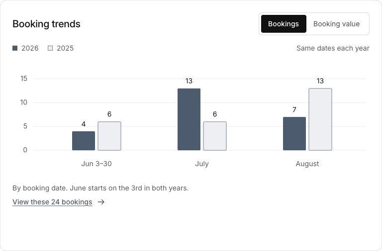
They liked the headline, but wanted the charts kept visible and asked for campaign-level detail.
The solution I carried forward
I used the homepage to explain the offer and two connected dashboard views to make results checkable. After the debrief, I kept that booking summary and restored chart visibility. Team and Hybrid explore two layouts for that balance.
Where the process ended
The process ended before the proposed three-day NYC trial.
Follow-through / Feature flags
I hadn’t used feature flags before. After the call, I worked through the SDK docs and learned how to set up a limited rollout.
A chart-led dashboard.
My post-debrief design
Sample data · desktop and mobile
Preparing the devices…
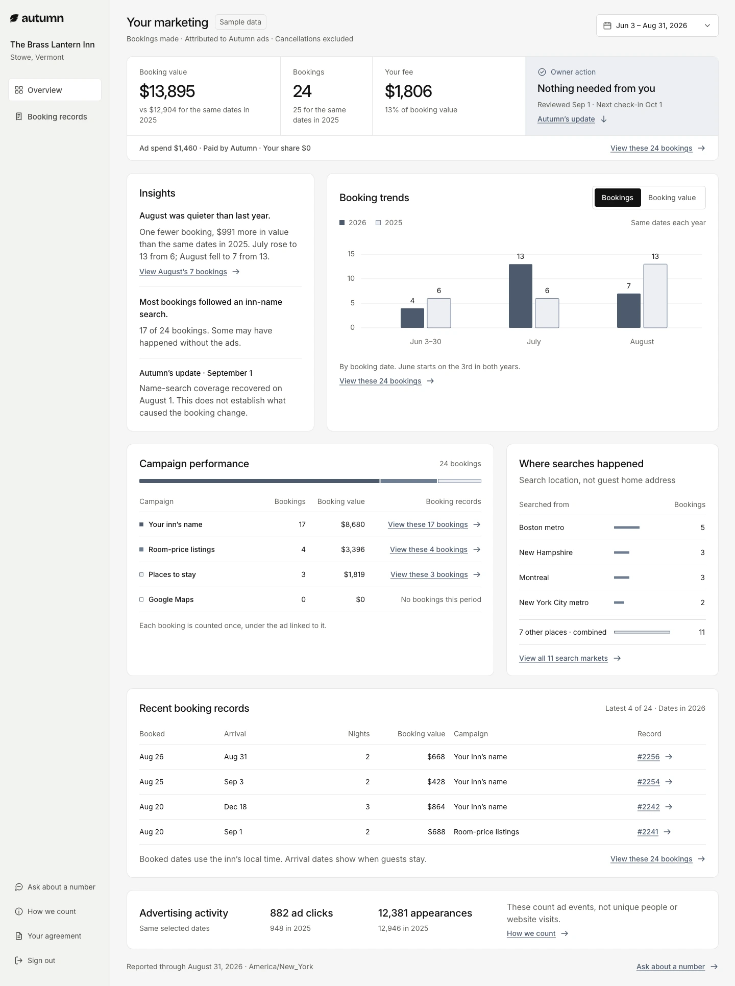
I paired insights with visible charts so owners can read the takeaway and inspect the trend without changing views.
Summary and charts in one view.
My post-debrief design
Sample data · desktop and mobile
Preparing the devices…
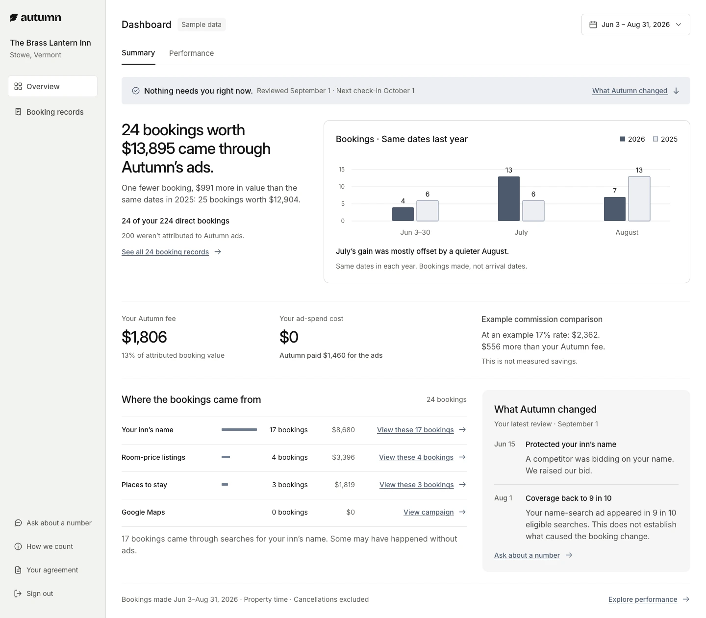
I kept the booking summary first, then placed charts beside it so a quick answer and a closer look share one view.
Run it. Trace it.
I seeded 730 days for a 12-room Vermont inn in Neon Postgres, including seasonal peaks and a competitor-bidding scenario. Both screens use the same bookings. A reconciliation test checks that the ledger adds up to the headline.
Public case-study demo · sample data
github.com/k-nn-y/matthew-kenney-autumn-take-home-2
Private repository · access required
Later design directions · Team & Hybrid
Post-debrief refinements, shown earlier in this study. The linked prototype remains the submitted build.
How I’d build it
next time.
I used AI in both exercises. Next time, I’d reuse the setup, aiming for a working first version in hours.
01 / Specify
Use a custom prompt generator to define each metric, the database structure, and the checks the build must pass.
02 / Build in parallel
Give Claude Code the Paper designs and database schema through MCP. Build the interface and sample-data scripts from the same definitions.
03 / Verify
Check that both screens show the same totals. Test date ranges, keyboard controls, mobile layouts, and slow connections.
Next, I’d ask hotel owners to explain a result and find the bookings behind it.
Open for full-time roles
Need a designer
who can build?
Tell me what your team is working on.
Matthew Kenney
Forward-Deployed Creative at BORN ON SUNDAY®.